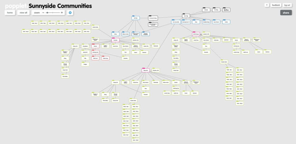
For this month’s Popplet People, we interviewed website design professional Adam Iscrupe about creating a sitemap using Popplet.
Adam lives and breathes website design through 3 complementary roles:
- He works at Hats Off Creative where he designs custom websites and print materials as part of a team of design professionals
- He volunteers on the Board of Directors for AIGA Charlotte, where he coordinates a monthly breakfast meetup to inspire the next generation of design creatives entering the industry, and
- He writes and edits for the forthcoming design blog Pixels & Picas, sharing his love of typeface design and website inspiration.
Adam has been using Popplet with his design team during website creation projects with clients looking for a new approach to their brand. We asked him about why he used Popplet for creating a sitemap and what features were useful for this type of design project.
Sitemaps present all the webpages – and links between pages – of a website in the one place. “A designer is a visual person, and in order to interpret the mechanics/hierarchy of a website, a visual presentation of how the website will look helps me tremendously,” explains Adam. “What I mean by that is a sitemap helps organize mass amounts of page content for a website in a clean, simple interface for a clear understanding. Without a sitemap, confusion without a doubt will set in.”

Q: Why use Popplet for creating a sitemap?
Popplet is one of the most friendly user interfaces I have come across in terms of online apps for building sitemaps. The design of it may look simple, but it is beautiful how each popplet can be easily resized, moved, or linked to another. Popplets can be color coordinated to correspond with other popplets if the user wishes (perfect for distinguishing navigation, an optional secondary navigation, and internal pages or external links), and my favorite aspect of the design is that each popplet snaps to a grid when moving them around. For me, it is also a huge plus that Popplet has developed an iPad app since the website is flash. This is another feature I don’t see a lot in other sitemap apps.
Q: How does the rest of your team find using Popplet for web design projects?
Our team uses Popplet as an internal tool in order to collaborate on developing a website. One of our team members is always travelling so he has the Popplet iPad app, which is a great tool for him to continue to update a sitemap remotely in real time. Since we are typically working on one sitemap as a team, Popplet has developed a great feature that labels each popplet that a team member has created, which makes it very easy to distinguish who has created what and has the ablility to leave comments for one another.
Thanks to Adam for sharing his insights into using Popplet for creating a sitemap. You can keep up with Adam’s work at his website, follow him on twitter, or keep your eye out for Pixels & Picas when his team launches the site in September with more design related articles.
Have you used Popplet for creating a sitemap for your web design projects? Share your sitemaps and website examples with us on our Facebook page or tweet us your links!.
Pingback: Overcome the Fear of Change to Help Business Growth: Heroik Media | Poppletrocks!